News Bar Re-Branding
Amongst modern restaurants offering quick service for hurried college students News Bar finds itself nestled between 12th and 13th street on University Place. The cozy café offers fresh bagels, sandwiches, and hot coffee. The small setting is contrasted by two large family style tables where students and locals intermingle over newspapers, magazines, and past due art history assignments. While the warm interior of this café offers cozy refuge from 5th Avenue commuters, I felt it needed a jolt of energy.
News Bar Café
Re-Branding
Initial Concepts
My initial idea with this project was to simplify the brand’s logo. Get rid of the repetitive lines, and the stagnant clip art style coffee cup. The concept of the café is simple; people gathering to eat, sit, and read. So why not boil the logo down to it’s basic anatomy. A simple, yet bold serif clad “nb.” I figured I could keep the logo so simple that it could be easily paired with any sans serif font when needed on business cards, pamphlets, or any other type of paraphernalia. While playing with this idea across a variety of different applications, I found that the standardized black and white “nb” was getting lost. Simply put, it looked like a giant typo on the top of the letterheads and business cards I was working with. I wanted to keep the bold confidence of a simple two letter logo while incorporating a graphic element. While I was a novice across the adobe suite at the time, I played with different textures, and image adjustments until I employed the pen tool to to distort and reshape the actual outlines of the letters. I would then fill in empty spaces with red, create outlines in red, and continue to tweak and adjust the shapes and levels of distortion until I arrived at a rendition that I was happy with.
Existing Design
Logo design
Visual Language Concept
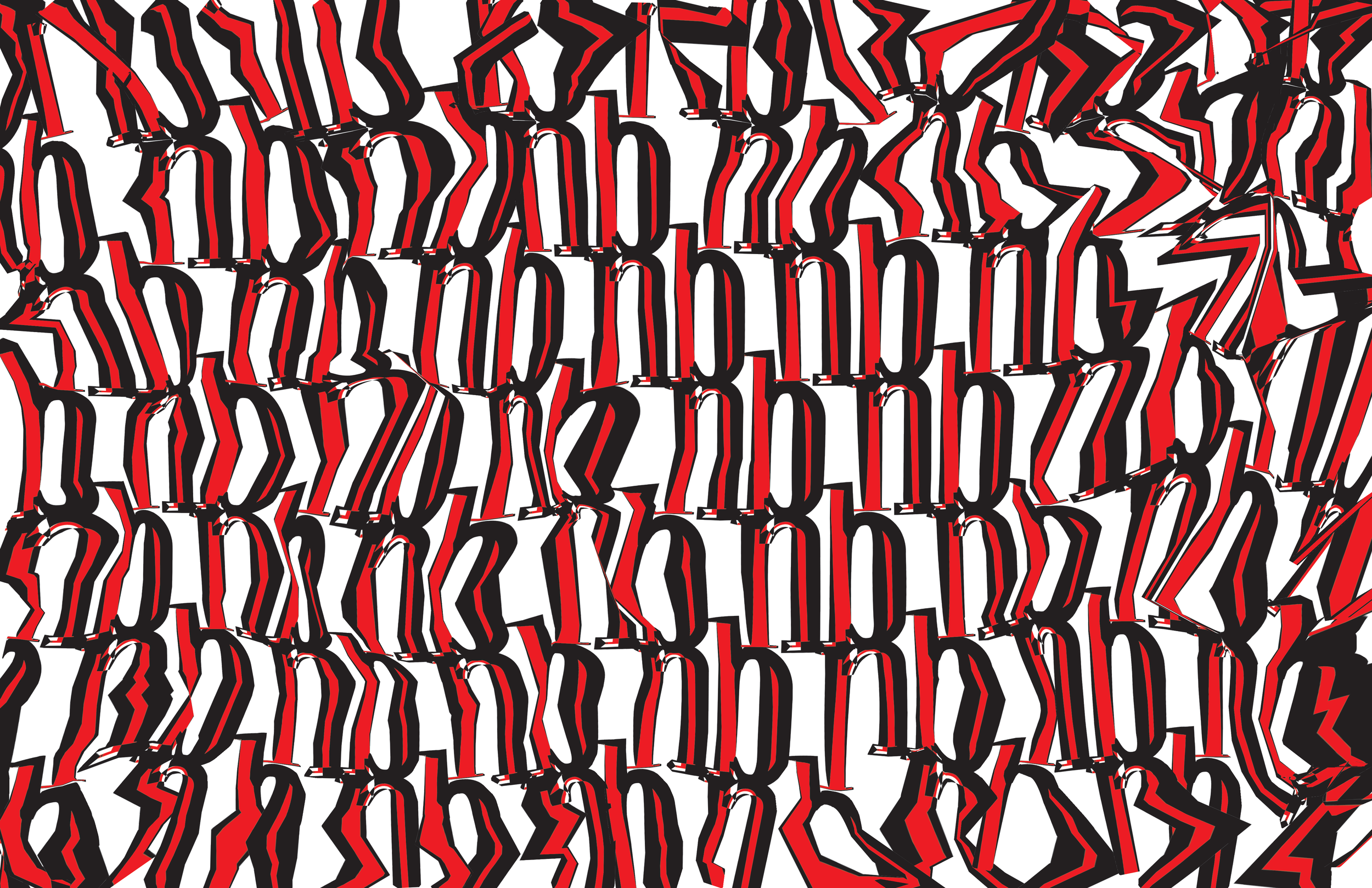
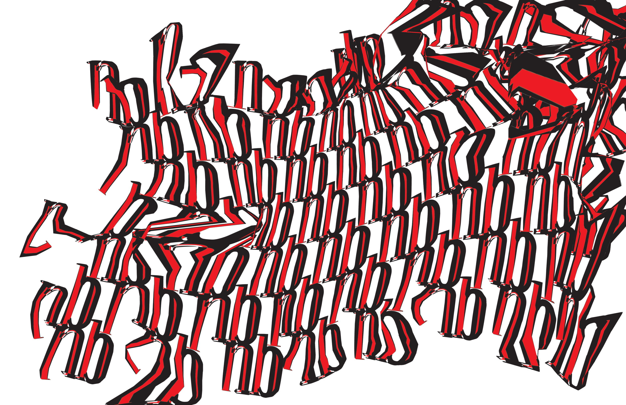
Once the logo was created I dived into the visual language that I could use throughout multiple applications across the brand’s identity. Once again focused on keeping the elements simple was my main goal. I scaled down and lined up the “nb” logo I created hoping an interesting pattern would present itself. However the pattern I produced seemed monotonous and uninteresting. Earlier in the day during a “Core Concepts” class we were experimenting with photoshop’s puppet tool. I thought I could create more interest, and add a sense of depth to the repeated “nb” logo. I pulled the puppet tool to extreme end of it’s spectrum, and discovered that I could manipulate this pattern in a similar way that I did to the logo. Distorting the shapes of the letters and adding more graphic and visually interesting shapes out of the once lifeless pattern that I started with.


