Logo inspiration
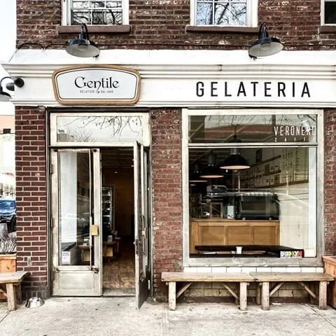
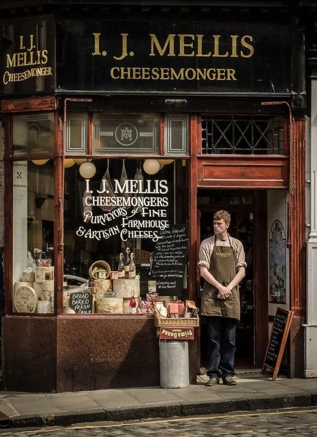
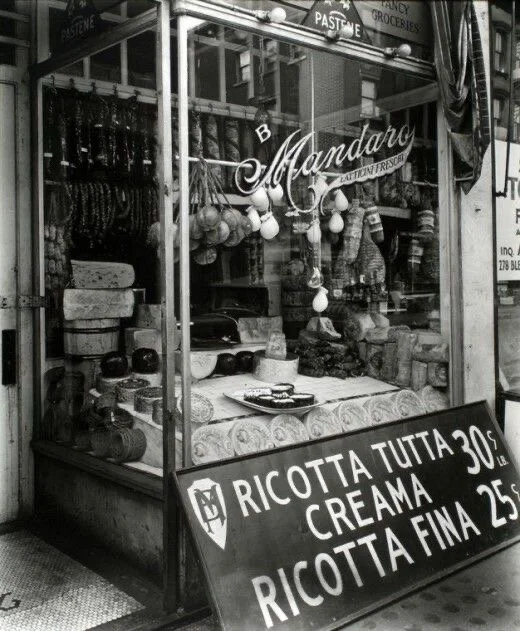
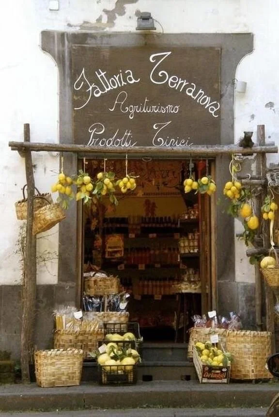
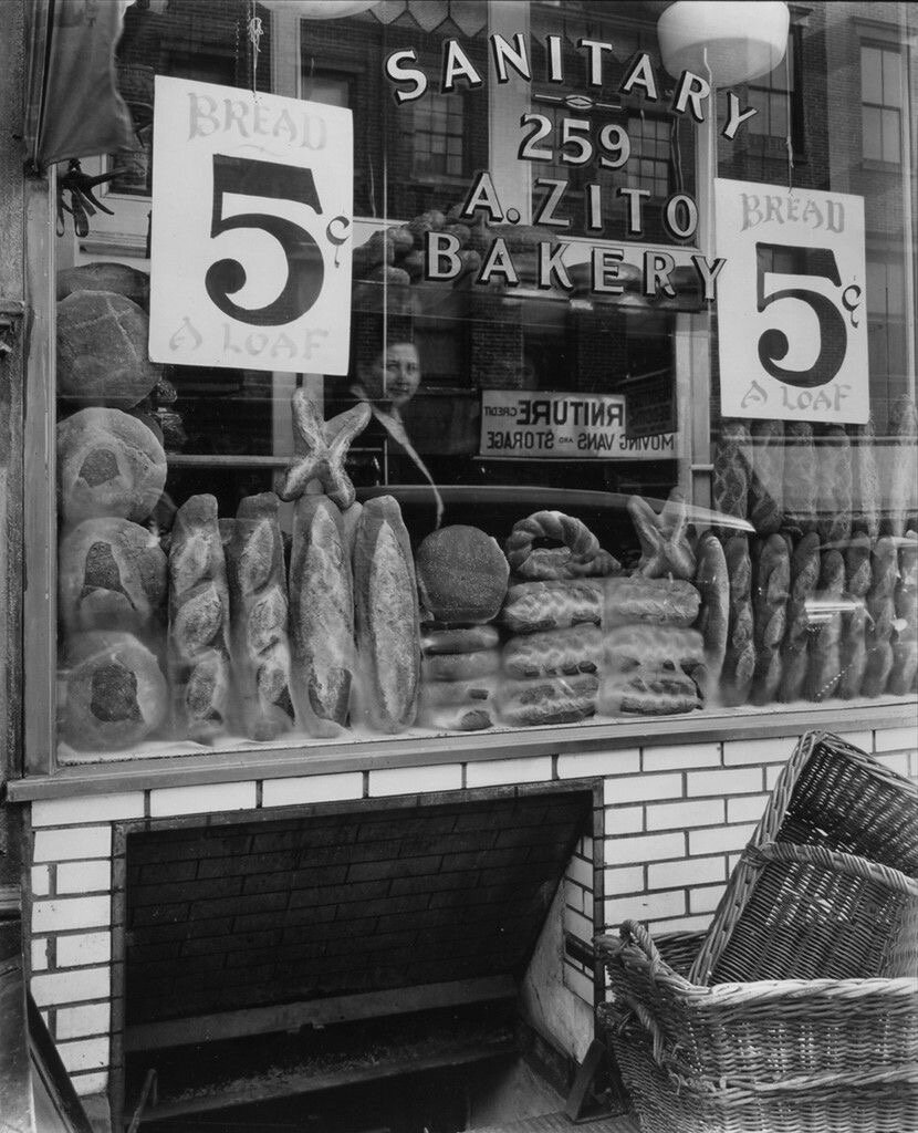
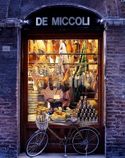
Inspiration for the branding of this modern Italian restaurant stemmed from logo types seen in store fronts of bakeries or Italian delicatessens. I appreciated the boldness of a logo adhered to the glass windows showcasing the company’s product. The clarity and simplicity of a well made product combined with the pride of putting your name right in front of it inspired the handwritten logo.
Final Mockups
A simple color palette allows the logo to remain the focus of these designs.
![61342 [Converted].png](https://images.squarespace-cdn.com/content/v1/5dfba36bb179981a568d3be1/1599785742163-GCVJB5HPH9OFLBXCFQBH/61342+%5BConverted%5D.png)


logo
The logo for this design takes it’s final shape as a handwritten signature. The scrolling letters provide a homemade feeling, perfect for what this restaurant has to offer, in terms of handmade fresh Italian food. The chef’s signature emblazoned on the building itself.
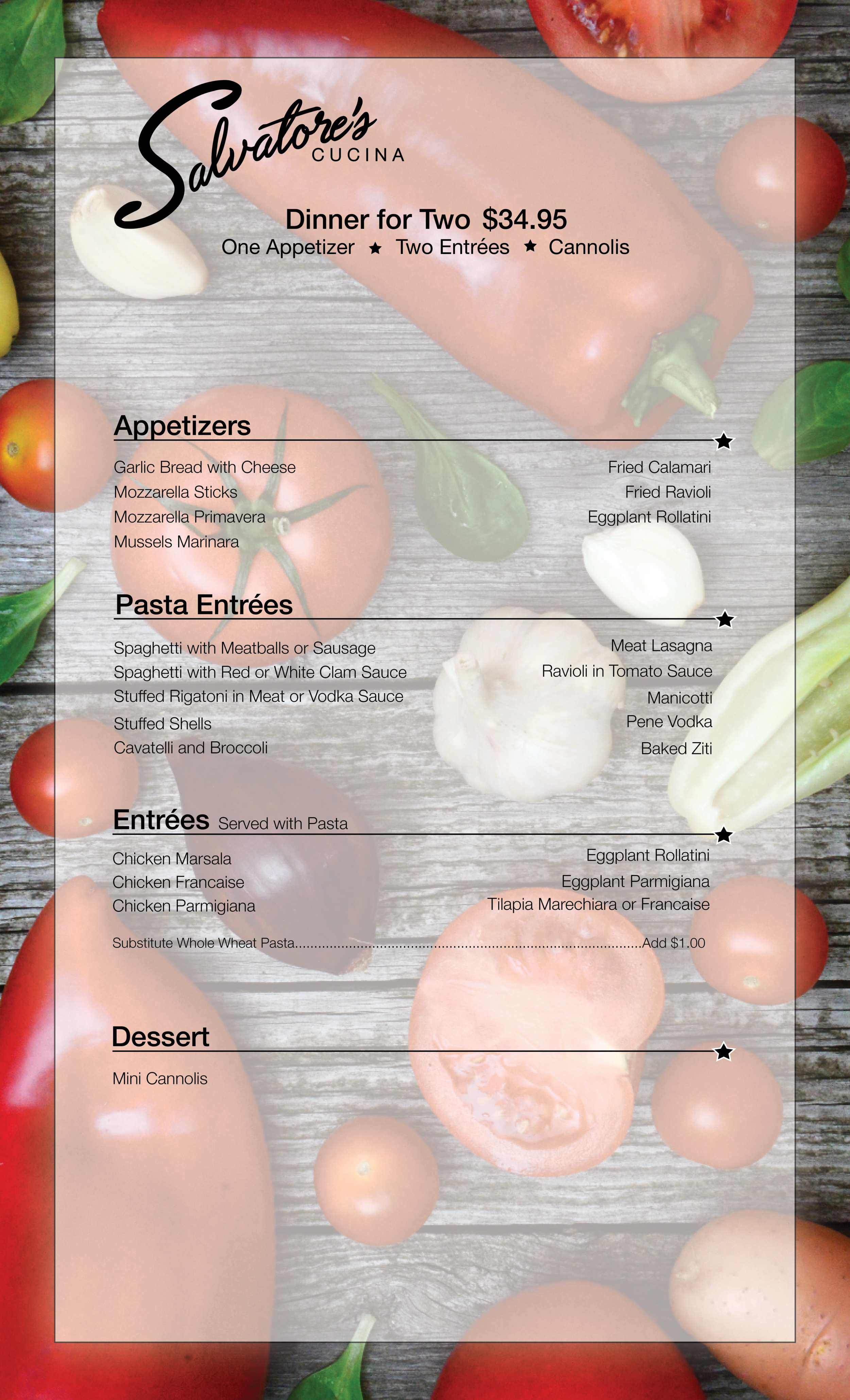
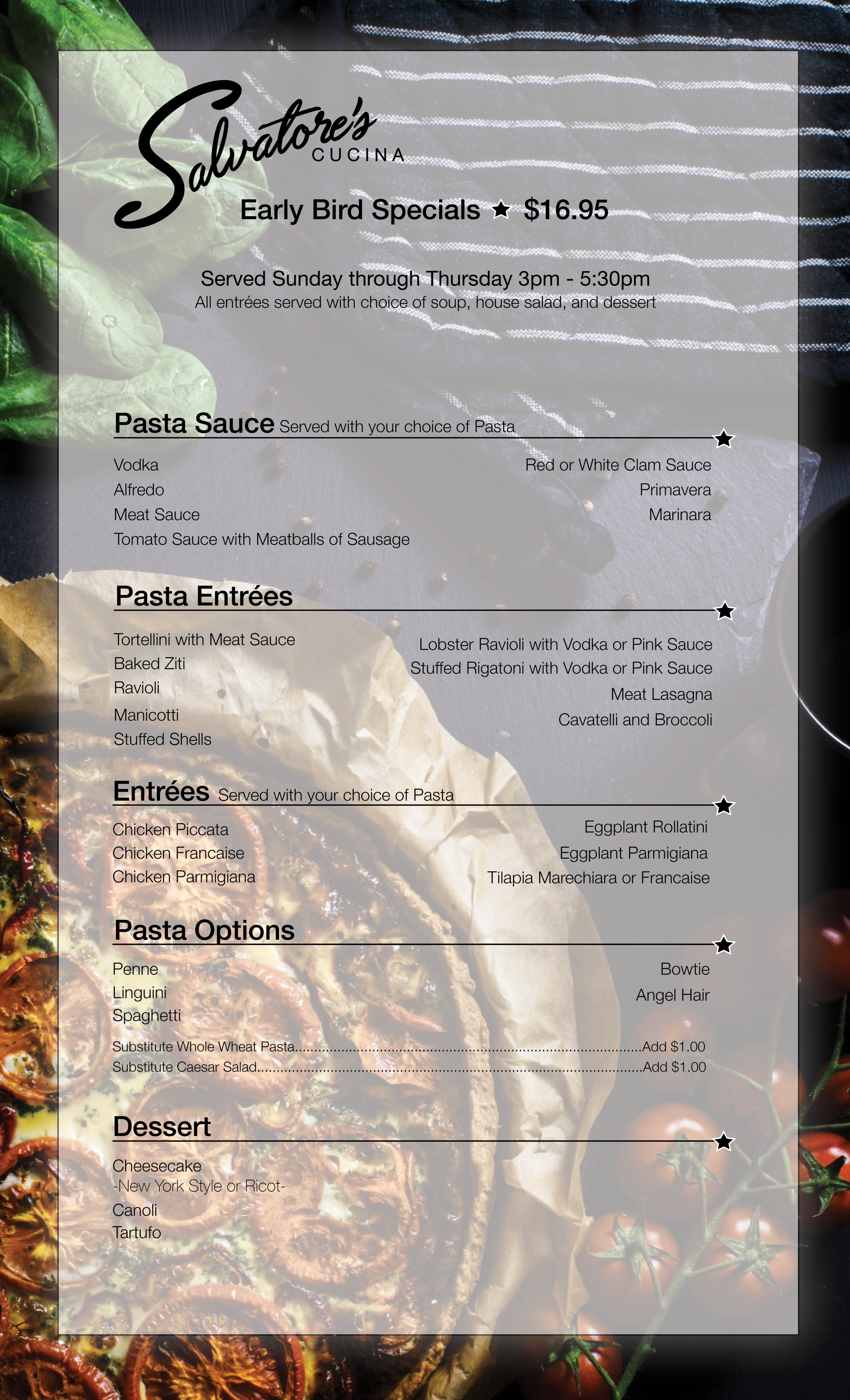
Menu design
The overall design of this menu was challenging due to the sheer volume of items needed to fit within a manageable menu size. Below you’ll find a prix fix menu as well as a special dining menu., I wanted the design of these menus to be clean and easy to read. I’ve added small embellishments that echo the design of the logo to bring a bring a sense of cohesion to the overall experience while diners are in the restaurant. Color photos were added at the request of the client.
Business cards
Along the front side of the business cards the simple combination of imagery and logotype evokes simplicity and entices the customer to visit the space. Flip the card over to see all that Salvatore’s has to offer, as well as key points of contact information.
Additional ephemera
To go menus and gift certificates were the final pieces created for this restaurant.
